Investing Angles
|
2022-2023
How can we empower people to make informed investment decisions?
Investing Angles is an educational blog dedicated to helping investors
at all levels make informed decisions through comprehensive analyses
and visual charts.
When the client approached us to revamp their website, they wanted a solution that would enhance user experience and accessibility, making it easier for users to navigate and find the information they needed.
When the client approached us to revamp their website, they wanted a solution that would enhance user experience and accessibility, making it easier for users to navigate and find the information they needed.
In this project, I collaborated with a developer and our client. I
took charge of the entire design process—from UX research and concept
development to prototyping, visual design, and usability testing.
The Problem
"I go to Telegram and search for Bitcoin ... in order to find the
link I want and open it using the browser."
“It is difficult to navigate through the
website, like finding an older post.”
"The website is overall very frustrating.”
“I want better access to daily reports.”
The Challenge
How can we redesign the site for simpler navigation and better
readability across many categories without overwhelming users?
Our goal was to refresh the look, improve accessibility, and help
users easily find the information they need to make confident
investment decisions.
The Result
We achieved our set goals and more: a 4x increase in conversions,
tripled the rate of returning users, reduced support emails by 68%,
and experienced a 40% surge in our Net Promoter Score.
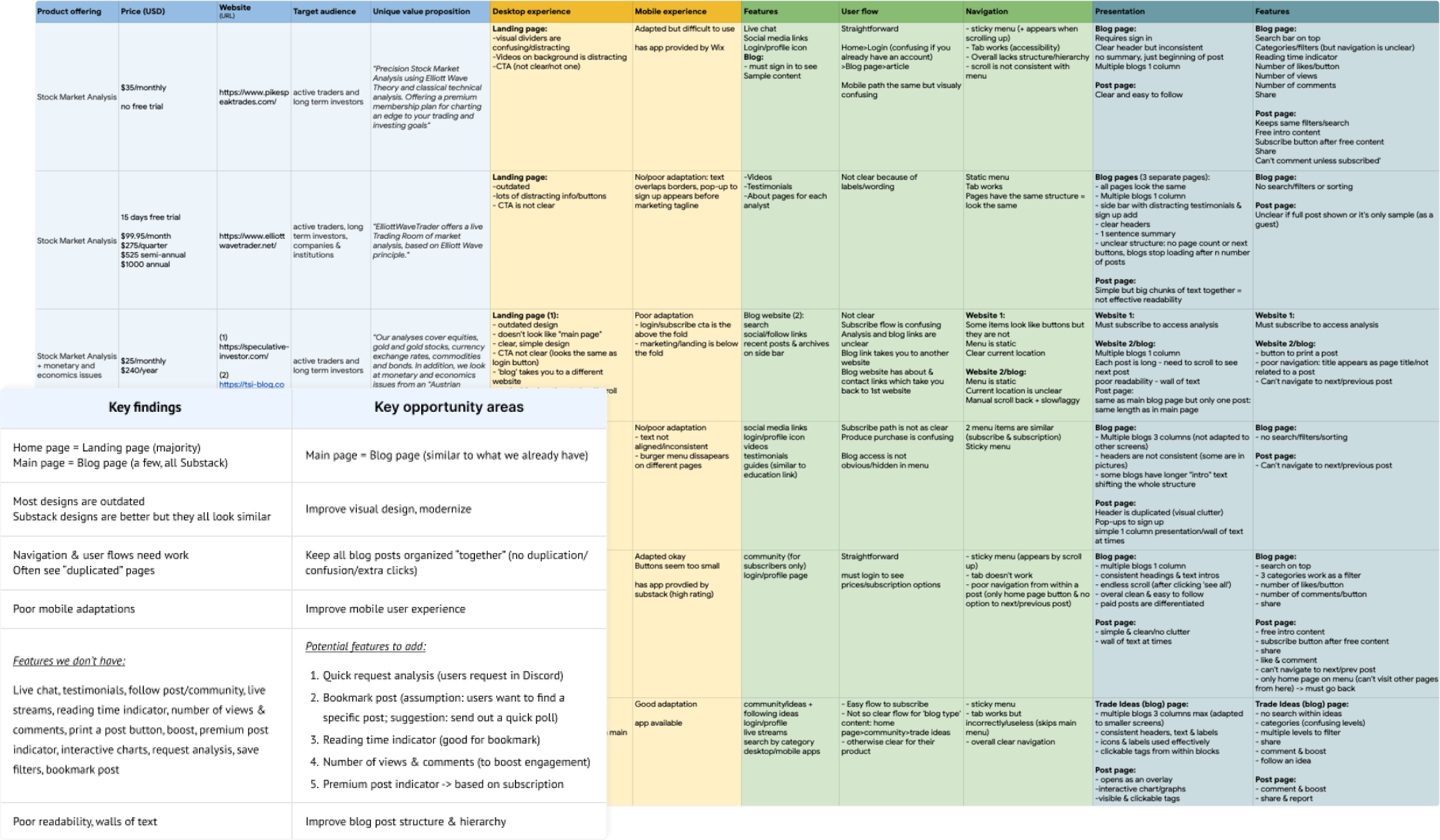
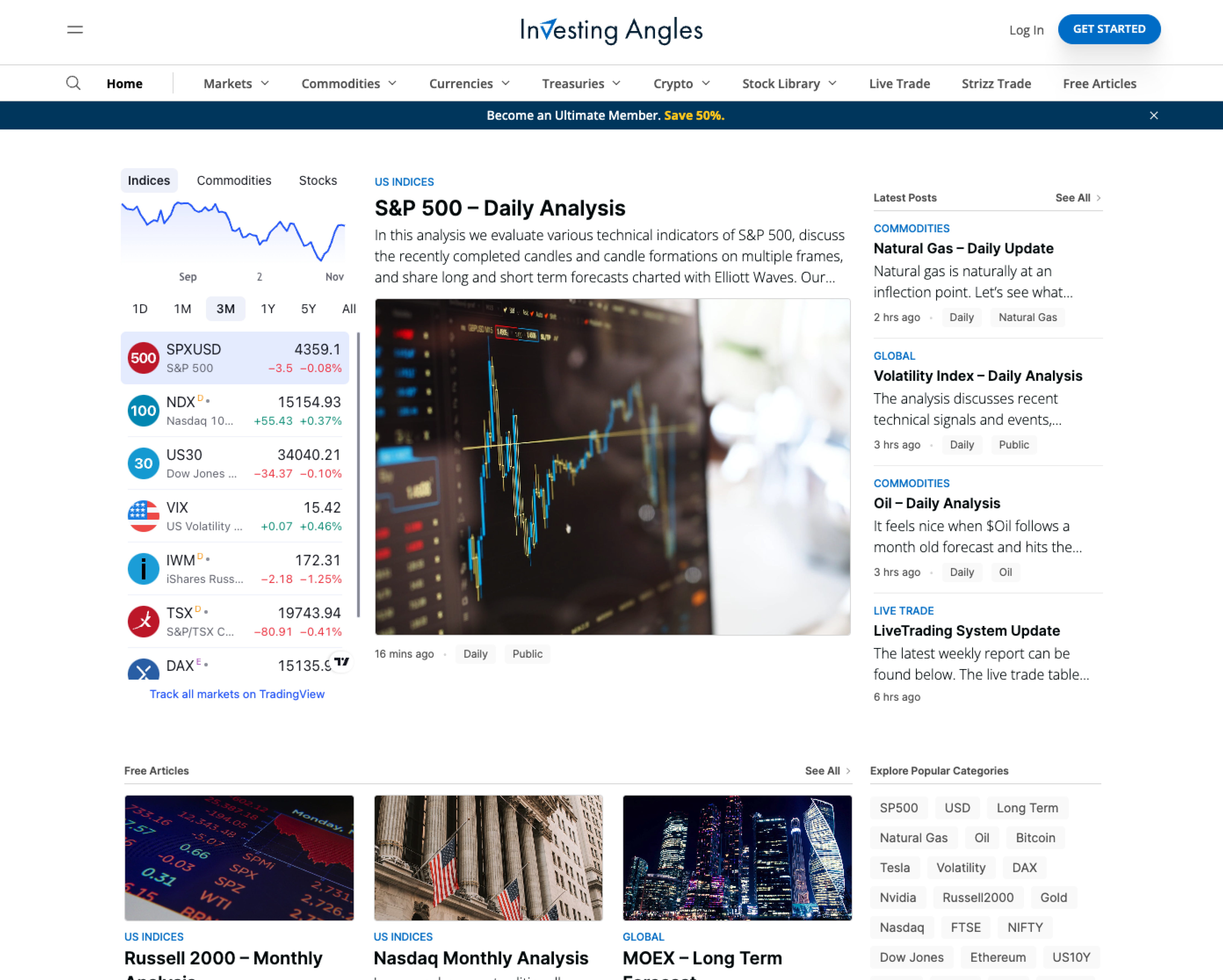
Understanding the project
I collaborated with the client to understand their goals, analyzed
website stats, and closely studied user behavior across devices.
Streamlining category and tag navigation was a priority for a
seamless user experience. I started by researching how industry
competitors structured their content and navigation.
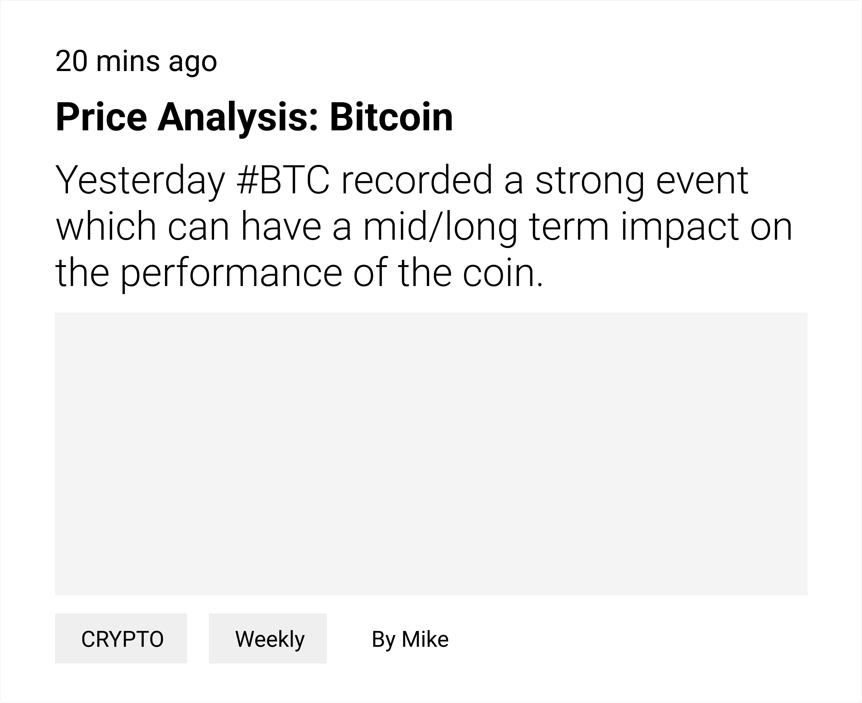
Examining a component:
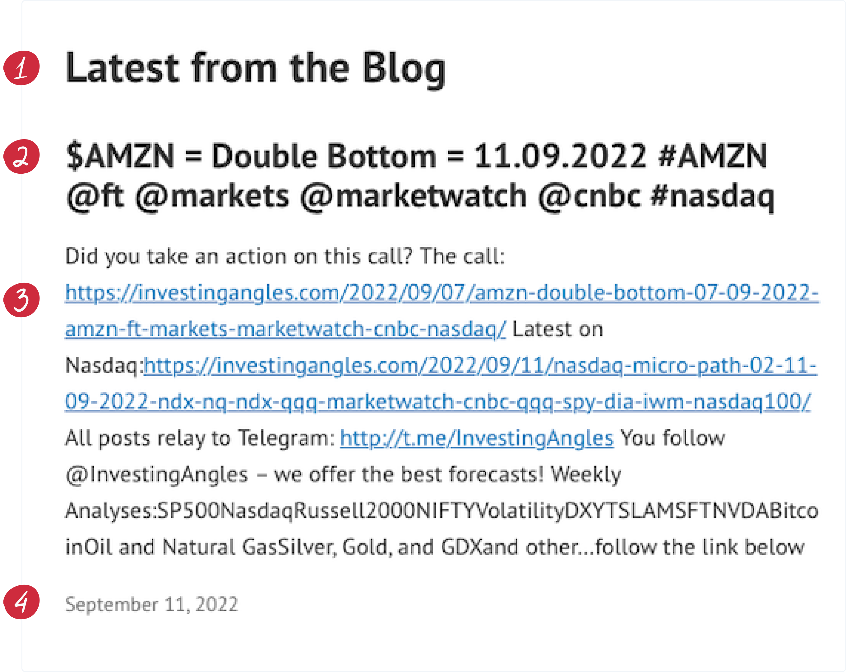

The section header resembles a title of an article, adding to a
lack of visual hierarchy.

The actual title of an article is hard to read, as it's made up
of non-clickable tags and categories that serve no practical
purpose.

The text description of the article is challenging to read or
scan because of lengthy links to other posts and unnecessary
tags. It's not a summary either, making it difficult for readers
to grasp the post's content.

For the most recent articles, the date isn't as useful. Given
the fast-paced nature of stock market developments, displaying
the time posted is more relevant.
After reviewing competitors, I looked to industry leaders like The New
York Times and Medium for inspiration, as their solutions to similar
navigation challenges provided valuable insights.
Understanding the users
Before diving into the redesign, we needed to understand our users'
pain points. What frustrated them? What were they looking for? Where
was the site lacking? What did users really want, and how could we
align that with our business goals?
We launched user surveys to gather insights into their frustrations
and needs. Using this feedback, I created a user journey map to
highlight areas needing improvement, focusing on opportunities to
enhance the user experience.
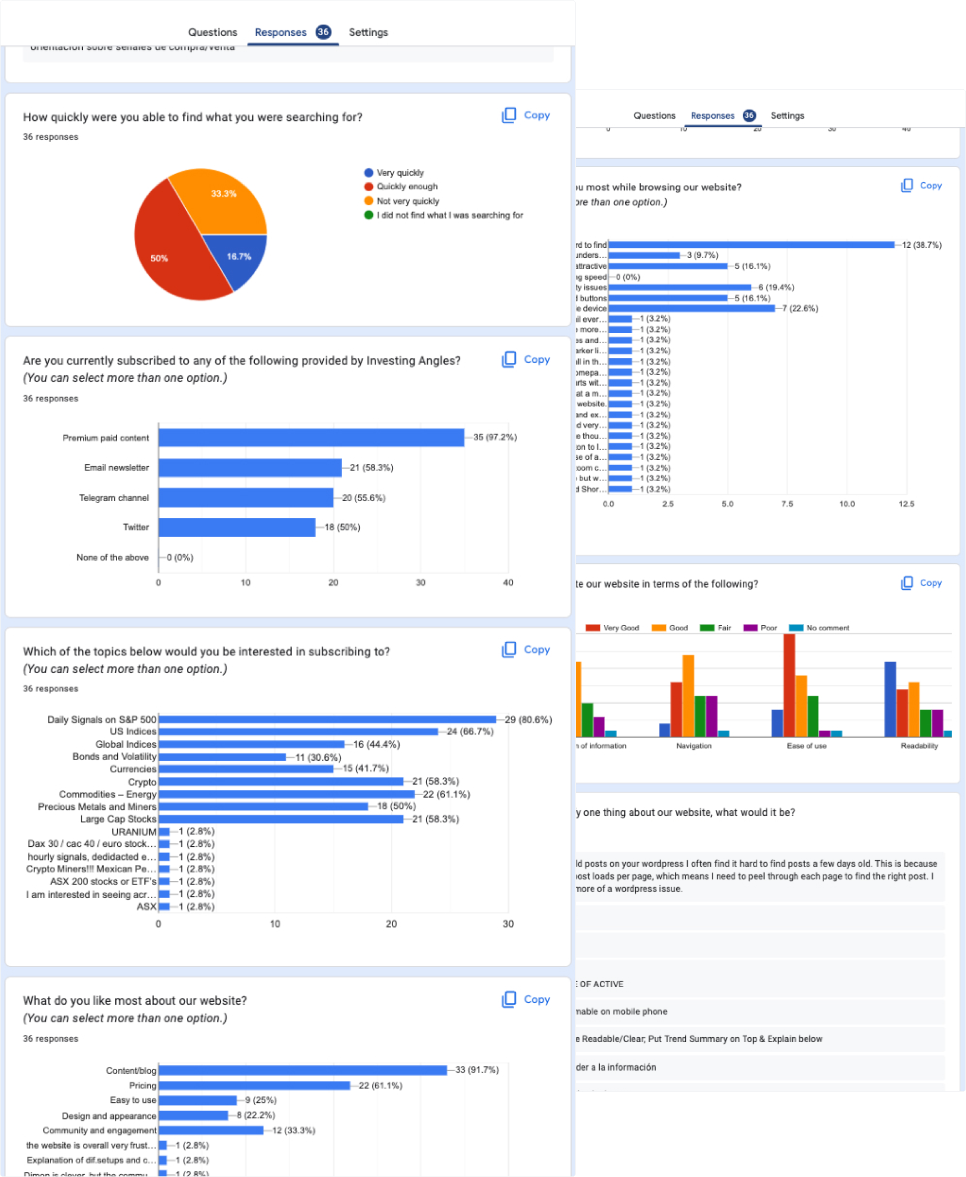

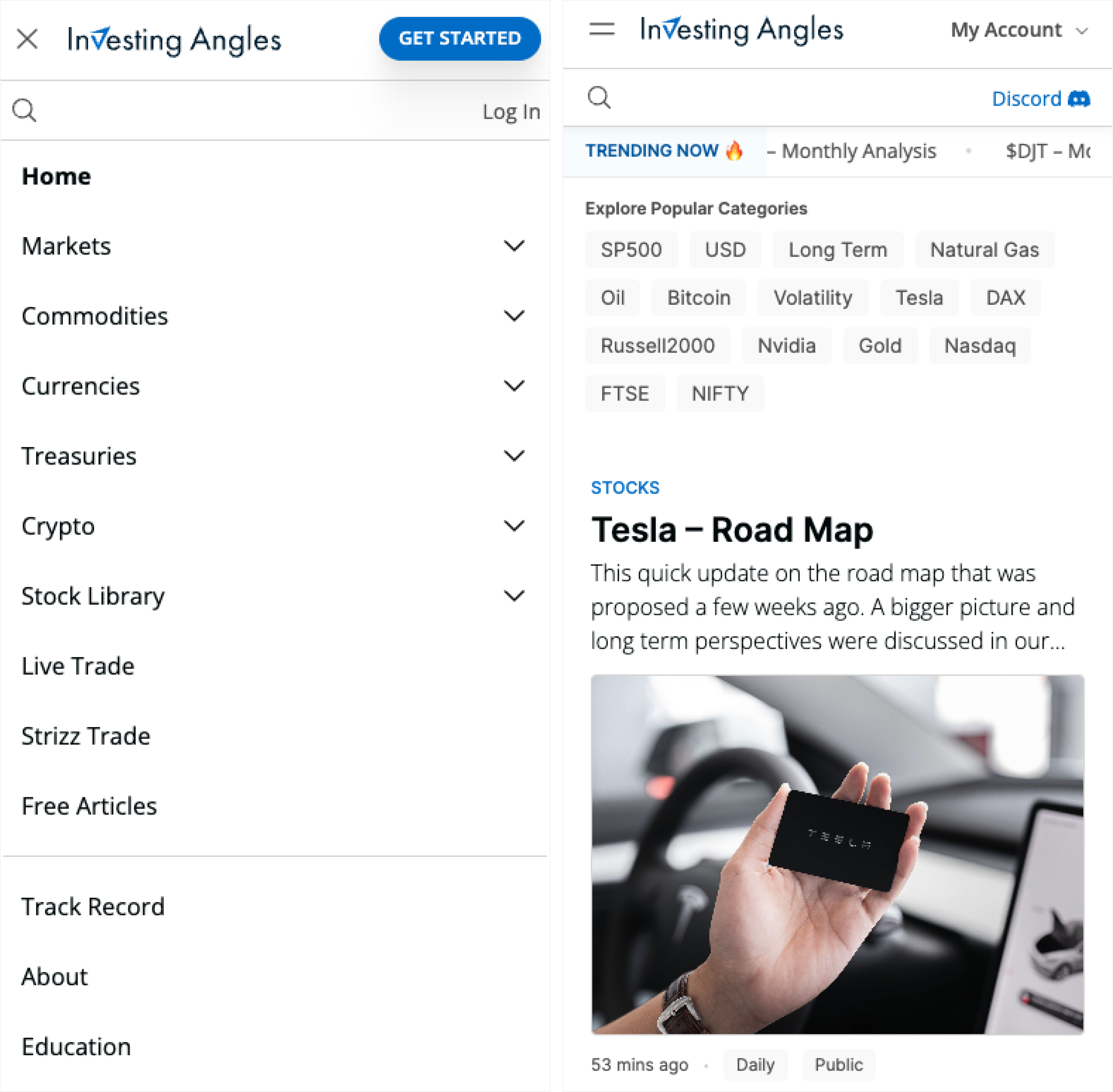
The login button is hidden, making it
hard for subscribers to find and access quickly.

Users struggle to find the search bar
due to its placement at the bottom of the home page.

Users waste time navigating multiple steps
to find the latest article.

Most users access the blog on mobile devices. With mobile usability neglected
, users are frustrated by readability and accessibility
issues.
Organizing Content
To make the content more accessible, I started by reviewing all
existing categories to see how they could be grouped under larger,
more intuitive categories. Clarity was key; we wanted a structure that
made sense to our readers.
Each analysis or blog post focused on a specific topic known as an
"instrument." With so many instruments, listing them all in the main
menu would be overwhelming. So, we grouped them into themes we called
"rooms."
Leveraging our research insights and the new category structure, I
mapped out the website's information architecture.
Exploring solutions
I sketched several main screens to quickly visualize ideas, prioritizing
easy access to key elements like subscribe, login, and rooms across all
devices.
Refining a component through iterations:

Readable time for articles within the last 24 hours.
Relevant image or graph enhances visual appeal and facilitates
quicker comprehension of article content.
Clean title and improved readability by relocating tags and
categories to the bottom.

The card doesn't accommodate multiple categories well and fails
to convey a clear hierarchy.
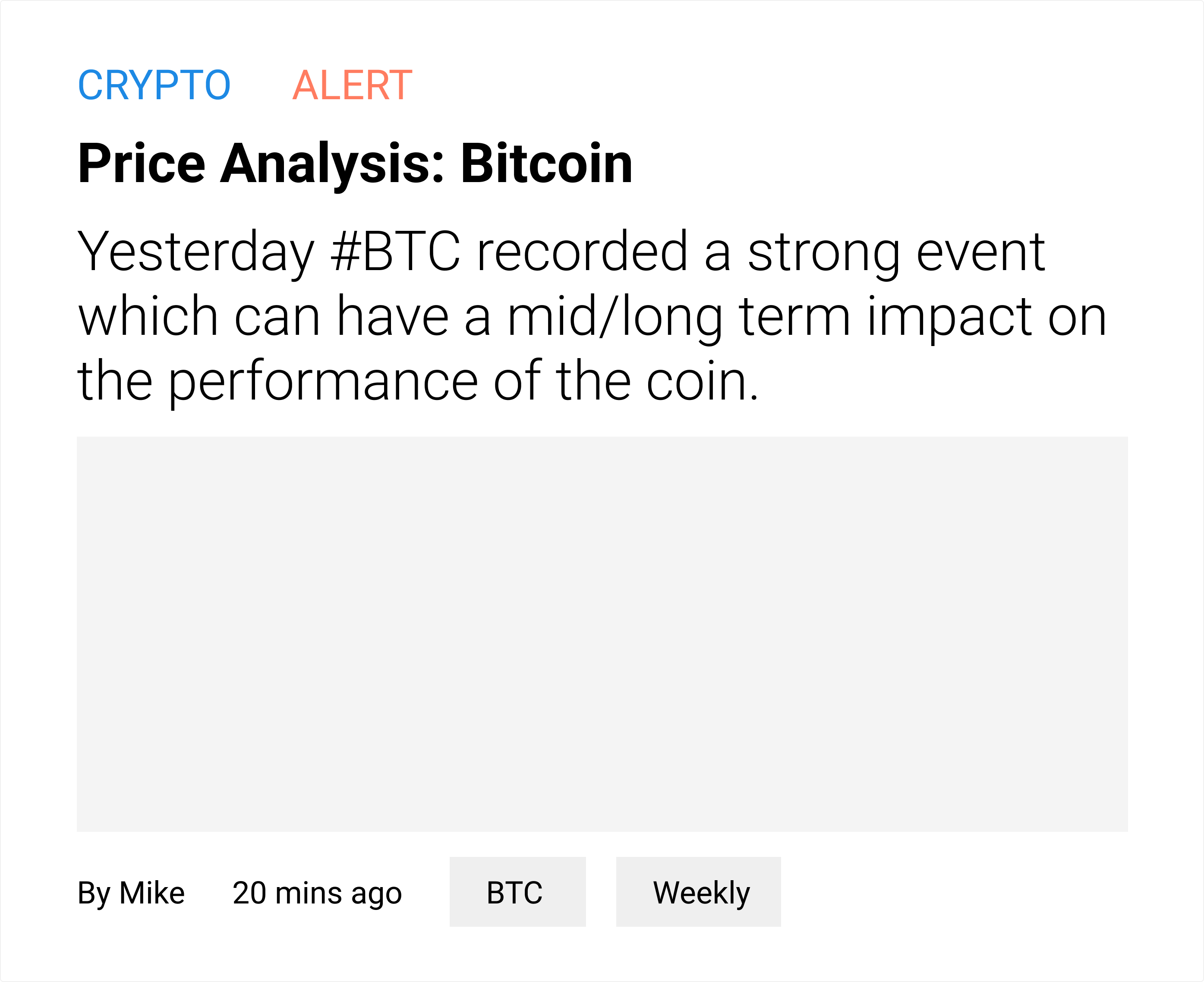
Improved category organization: the parent category stands out
at the top in our brand colour, and the child category listed as
a tag at the bottom, allowing easy access to both.
Easy to understand the type of article (alert, trade signal,
study) by clearly differentiating it from both tags and
categories.
The grid system gets thrown off creating a cluttered appearance
when multiple cards with varying title lengths and fixed image
sizes are placed in rows.
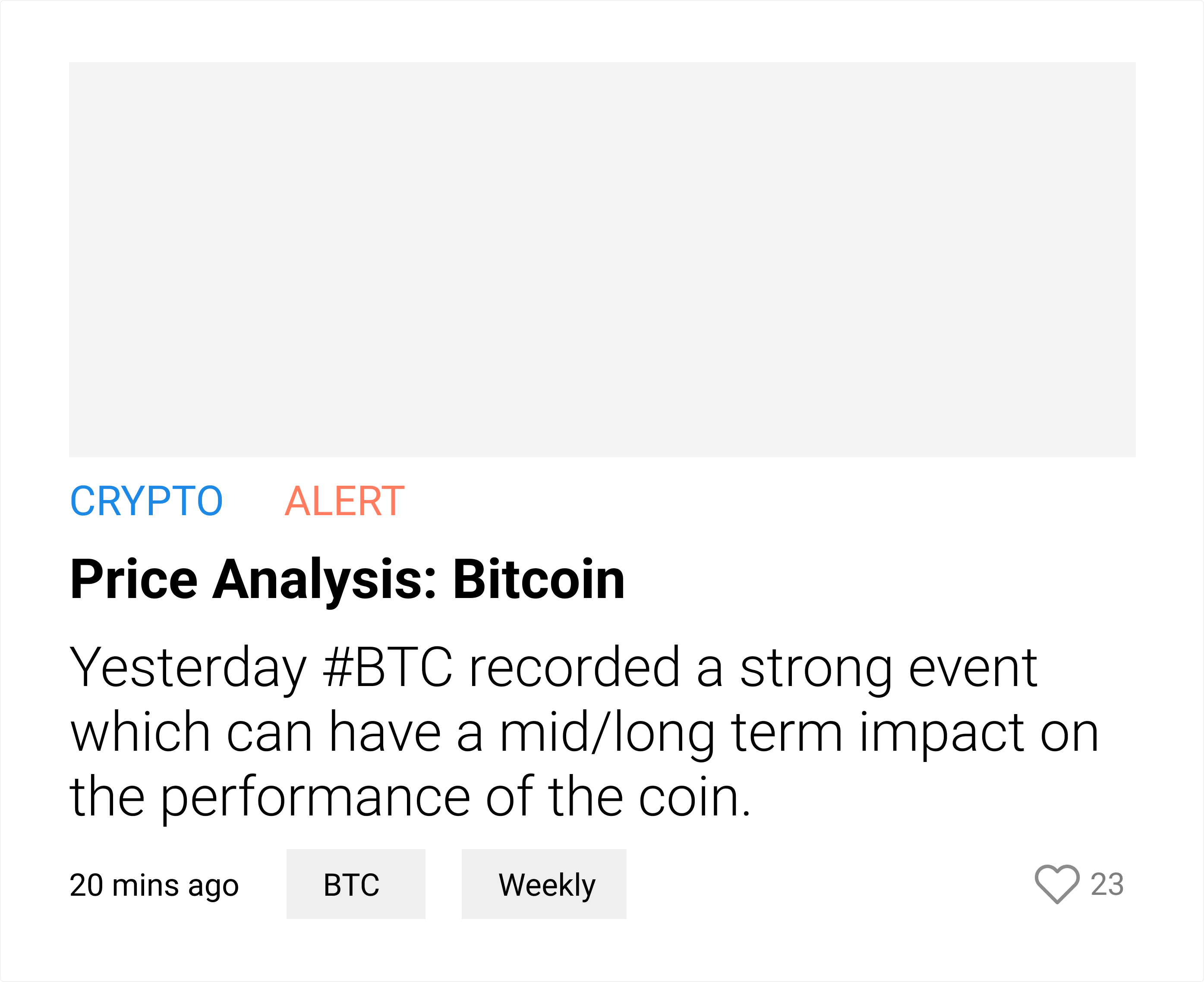
The grid layout is now consistent by swapping the positions of
the image and content. Regardless of how long the title is, it
won't disrupt the image placement.
The time/date is displayed first for fast scanning, while the
author name has been moved to the article page for a cleaner
card design. This allows more space for any additional tags.
Displaying the number of likes on the card encourages user
engagement and piques interest.
Testing Prototypes
After multiple iterations, we developed a detailed prototype ready
for usability testing. Our aim was to ensure the design was both
visually appealing and functional, while identifying any potential
issues.
We conducted hallway usability testing with five participants.
During these sessions, we encountered a few minor issues, which I
addressed before handing off the final designs to our developer.
Launch
We launched the MVP on February 6, 2023, aiming to provide easier
access to content and introduce the new website to our subscribers.
Additional design elements and features are being tested and rolled
out in phases.
Visit the site
Validation & iterations
Post-launch, we conducted validation tests using Microsoft's Clarity
tool. While users found the website easy to navigate, we identified an
issue with the image lightbox: users couldn't pan or scroll
horizontally when zoomed in on a graph.
We quickly explored alternative solutions and implemented a fix within
a day. Subsequent tests confirmed that users could now effortlessly
zoom and scroll horizontally without any issues.
Easy Navigation
The original website was difficult to navigate, with an unclear search
and login process—there was no visible link or button—and no
discernible way to locate desired content due to a lack of defined
categories.
In the new website, we improved the experience by making the login
button and search functionality clearly visible, and organizing
content through well-defined categories and tags. This reduced the
time users spent trying to find what they needed.
Readable & Accessible
The previous blog page design made it challenging for users to quickly
scan important content. Links cluttered the interface, elements
blended together lacking visual definition, and categories and tags
were included in titles, making them difficult to read.
We simplified blog post titles, reorganized categories into tags, and
visualized them to improve clarity. We optimized line length and
height to enhance readability. This reduced cognitive overload and
made scanning pages faster and easier, enhancing the overall user
experience.
See next project
Restaurant Koster
2024
Enriching everyday dining experience.